Marketing Class Blog
Monday, April 25, 2011
Response to Eric's Stumble Upon post
I think companies could use Stumble and get very good results. The site gets high traffic and once you're on it it's pretty hard to stop. I think if marketers and companies decided to use the site and maybe throw on some logos or a brought to you by or whatever it could really help them become more popular and reach a fan base they normally wouldn't have.
Starbucks After a New Market
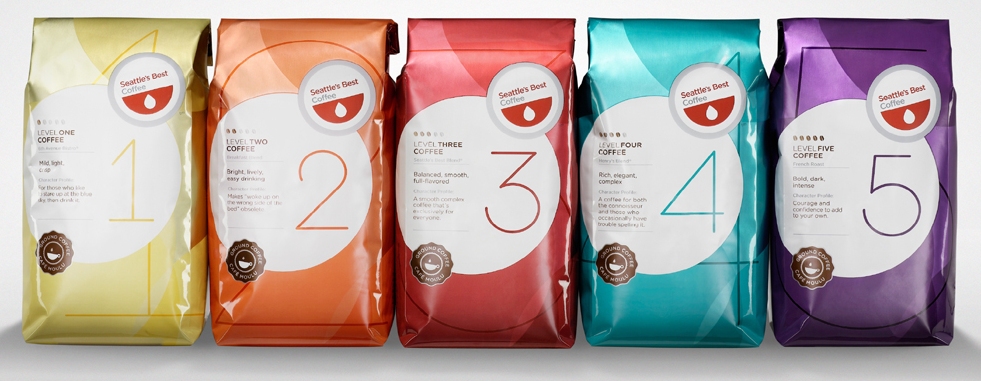
Starbucks has long been the brand that people associated with class or money. That image has served Starbucks very well for years but they're now after a different image and a different crowd. No longer do they want that guy who writes in public Starbucks is now after the average middle of the road coffee drinker. Seattles Best Coffee the small brand that Starbucks acquired 8 years ago is after the average joe coffee drinker. The Person they've placed in charge of the operation is hoping that a simple bag with out a logo and just numbered to distinguish the types of coffee with work. The bags are numbered 1 thru 5 to help customers distinguish between light roasts and dark roasts. The idea behind the campaign is to capture the people who like generic coffee which Starbucks is not. Do you think that this new campaign by Starbucks to try and capture the section of the market that they've alienated for so long work? Do you think the idea that making the bags look generic will work?
Below i've included a few pictures of the bags for a reference
Below i've included a few pictures of the bags for a reference

Monday, April 18, 2011
In Response to Abby's Kindle Blog
I think the lower prices might draw in more customers. Now Im not very familiar with e-readers or the books you can get with them. But I've always wanted to see maybe e-readers being used in college for books. I always thought that it might be a cheaper option and if offered I think students might prefer it. Hopefully as prices drop more students and colleges will start to realize the potential and start moving towards e-readers instead of textbooks
Is Your Website Self-Absorbed?
 I stumbled onto an article on Marketingtoday.com that talked about websites being too self-absorbed and how it can affect how possible customers react. It was interesting to read because I personally have never experienced a website like that but after reading I decided to see if i could find one. After a while searching I still couldn't find one but it got me thinking about the campus mom project and his website. I was wondering if his website could possibly be sending potential customers away. At first glance I didn't think so but I think that it may be something to definitely look into. An optimized website that is easy and fun for customers to use is far more effective. Do you think the campus mom website could use some work? If so what would you do to make it better.
http://www.marketingtoday.com/emarketing/0305/narcissistic_web.htm - The article from Marketingtoday
http://www.campusmomlaundry.com/ - The Campus mom website in case you haven't seen it
Sunday, April 10, 2011
In response to Lia's Starbucks
I can't say I'm a fan of Starbucks or coffee for that matter but I am a fan of the Starbucks approach to marketing. I couldn't agree more with the fact that Starbucks changed it up by not advertising on TV and really relying on their customers to get the Starbucks name out there. They've managed to become a big name business while still being that low key cool spot look and feel. Starbucks has continually been able to come up with ways to keep their patrons coming back whether it be the wi-fi or the atmosphere people definitely seem to love the place. Starbucks has also drawn attention to itself in another way that I think is quite interesting. People love to hate Starbucks! Whether it be the guy writing in public just so people can see, or the stuck up attitude that comes with being a Starbucks customer, people love to point it out. However in doing so they just draw more attention to the company so good job Starbucks you've managed to get yourself out there with out really advertising kudos to you.
Baseball's Epic Beard
Brian Wilson is a closer for the San Francisco Giants known for his beard and personality. Major league baseball has some new ad's out in honor of opening day. The commercials being aired feature Brian Wilson's beard and it's strange inhabitants. In one commercial there are ninjas fighting in his beard and in another lumberjacks cutting down stalks of hair. The point of the advertisement is to draw attention to MLBalwaysepic.com a site that has just recently come to light. I think the ad's are great, Brian Wilson is quite a character and to have him (and his beard) featured in a commercial adds a nice funny side to baseball a normally fairly serious sport. The reason I chose this ad is because normally I'm not a very big baseball fan, but after seeing the ad's and interviews with Brian Wilson I'd be lying if i said I didn't want to watch more baseball. With that in mind I can't help but think that maybe others around the country are finding a new interest in america's past time. Are these commercials working for you? Do you think this new funnier side of the MLB would help attract some new audience members or maybe repel the older more traditional ones? Just in case you haven't seen the new commercials or interviews with Brian Wilson, i've included some links below.
http://www.youtube.com/watch?v=mIlyu6ZGWI8
http://www.youtube.com/watch?v=0c4R-_0gMEw&feature=relmfu
http://www.youtube.com/watch?v=zC52rkgkNgU

http://www.youtube.com/watch?v=mIlyu6ZGWI8
http://www.youtube.com/watch?v=0c4R-_0gMEw&feature=relmfu
http://www.youtube.com/watch?v=zC52rkgkNgU
Sunday, April 3, 2011
The Science Behind Labeling
After talking about labeling in class this week I got to thinking about just how important labeling is. I mean obviously it defines one product from another, it tells us what it’s supposed to do, and it’s supposed to appeal to us the consumer. That last part is the thing I decided to focus on, how packaging appeals to us. Companies spend millions on research figuring out what it is exactly that we desire in a product. They’ve gotten so good at it that it’s down to a science; everything about packaging is specifically designed that way. What color it is, the size, the outline, all arranged perfectly to make us want to buy. I mean why not? If I were a CEO of a giant company I’d do everything I could to try and make that buying process that much easier, that much quicker, that much more pleasant. The problem is do you think there’s a point where they may have gone too far? These companies are beginning to tap into sub-conscious response mechanisms when designing packaging or whatever that we can’t control. During Christmas shopping stores play faster Christmas songs to try and make people un-easy and in a rush, they want you in and out. They want you to pick up that over priced present and to not have a second thought about buying it. This isn’t the only example there are examples everywhere of companies using tricks like this to make that buying decision easier for us! I guess my point is do you think it’s ethical for companies to do this kind of thing. Is this borderline subliminal messaging? Sure we have free will we can always just say no, but in my opinion the odds are stacked against us. What do you think, should there be some limit, or do you think companies should continue to these kinds of things?
Subscribe to:
Comments (Atom)